Curl - Packaging & Brand Design
Label, Packaging, Brand Identity, Typography & Illustration
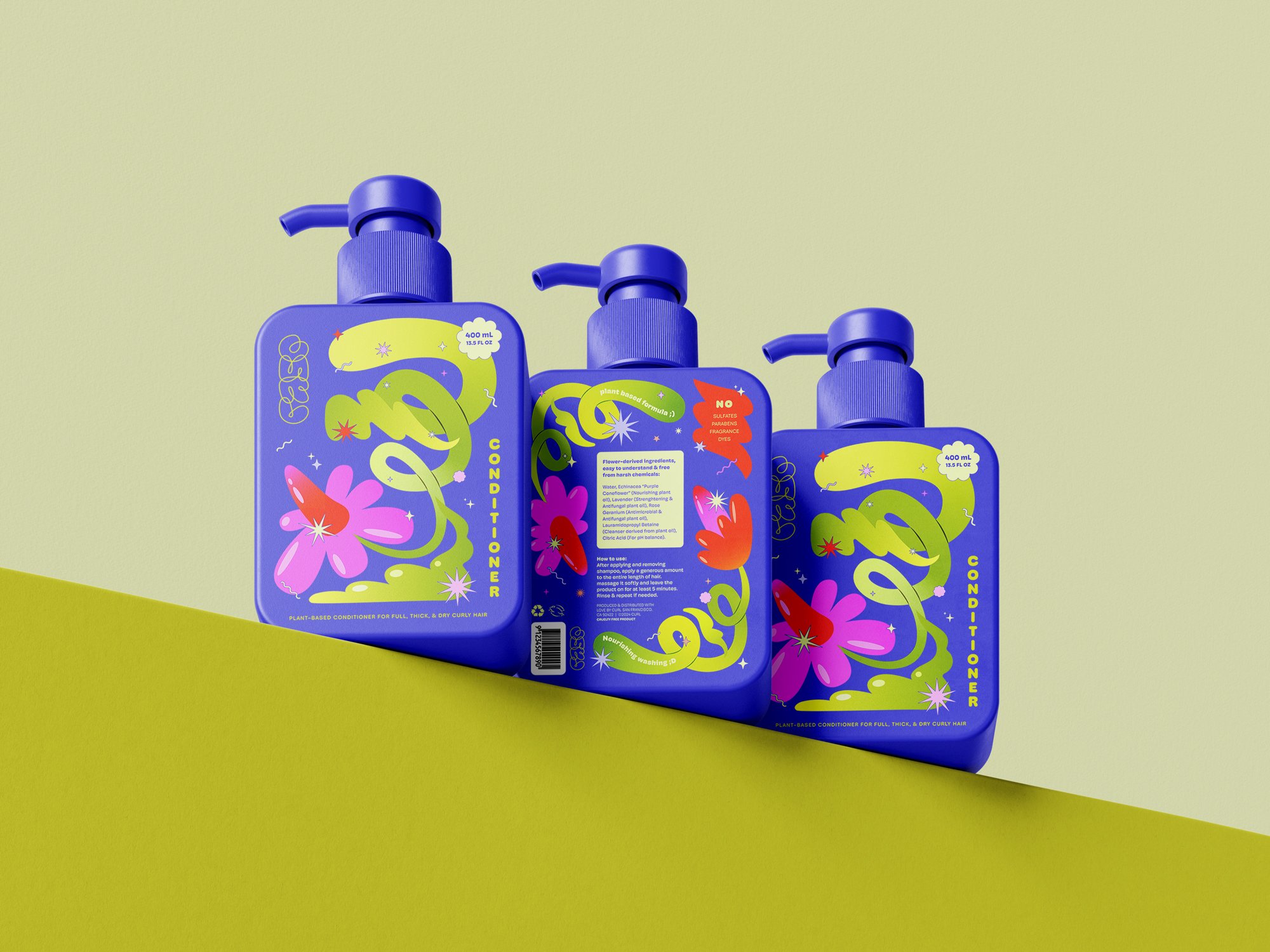
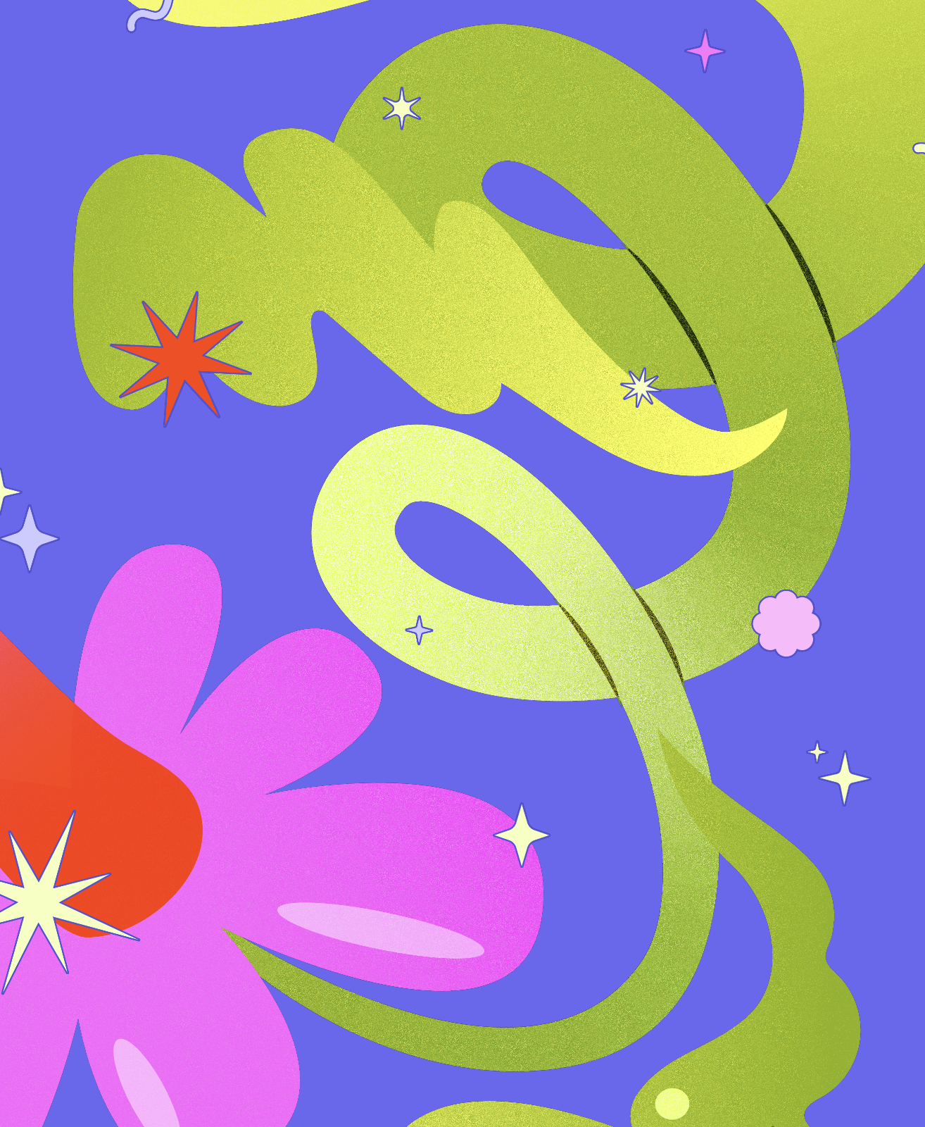
Curl is a colorful concept brand of natural hair care products for curly & coily hair. Most high-quality products on the market usually remove colors and elements from their packaging, seeking minimalism to evoke a feeling of exclusivity and status but finish as visually uninteresting, invisible on a store shelf. Curl seeks to be eye-catching and unique, relying on beautiful hand-drawn illustrations to represent our main ingredients: Flowers. Purple Coneflower, Lavender, and Rose Geranium are just a few surprisingly powerful plants that can clean and condition without striping follicles from their original oils, leaving curls clean and bouncy.
The inspiration for Curl’s visual identity comes from its target audience: Creative young people who love to style their curls in the most diverse ways. They are far from basic and have high standards when it comes to harmful ingredients. After all, curly hair is sensitive and requires a lot of moisture.
The Curl logo is hand-drawn and organic in shape, just like the illustrations, it alludes to the various twists and twirls present on a healthy strand of curly hair. The typography is clean, round, & energetic, conversing beautifully with all the other hand-crafted elements. This fun label design is just like our curls, naturally expressive.
Illustrator & Designer: Mickt Flior | @artsymickt
Initial sketches for the cleanser and conditioner labels, where the final idea, including placement of elements and text is expressed in simple hand-drawn doodles.


